Germany
- Cultural
- Competition
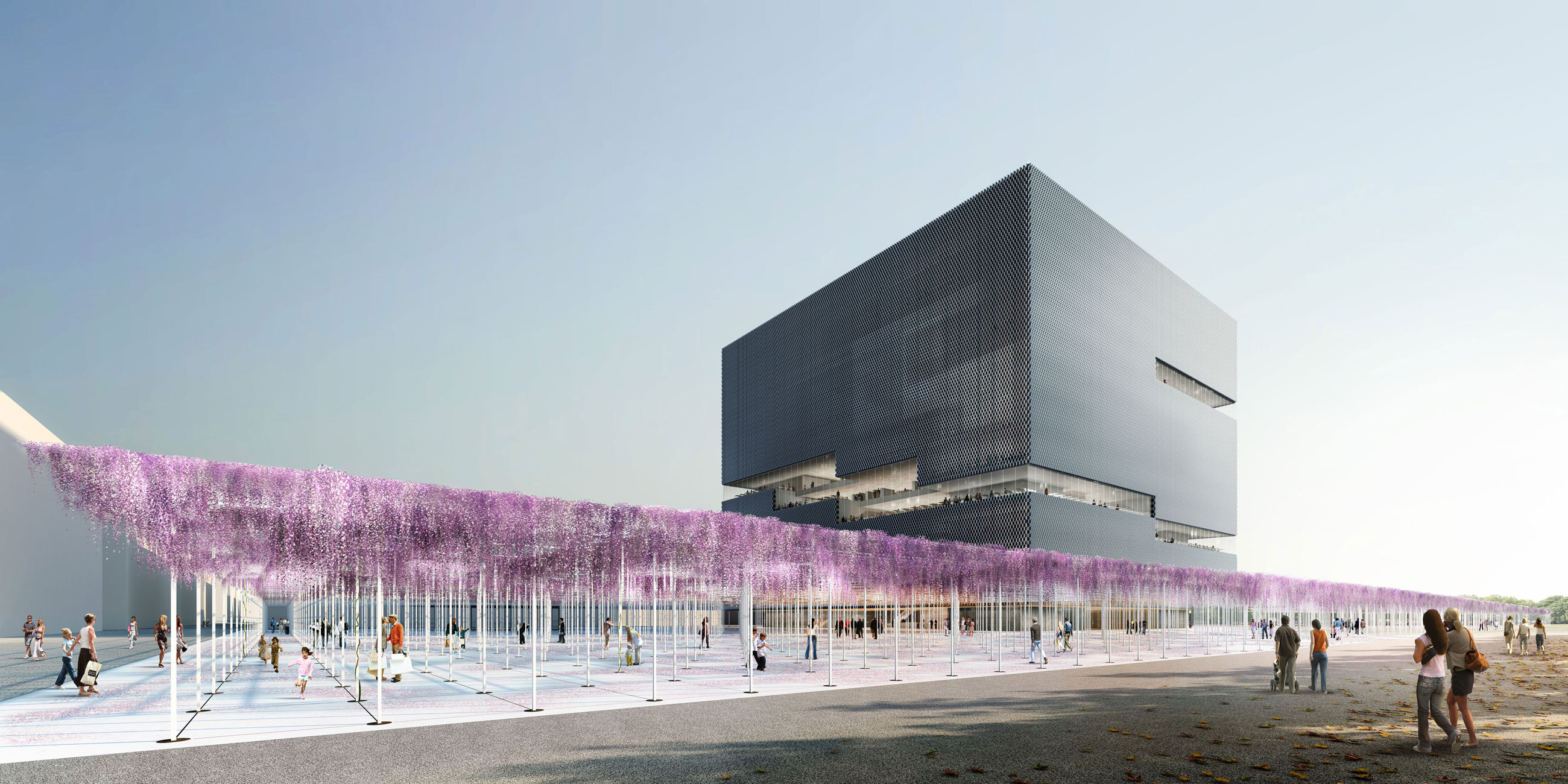
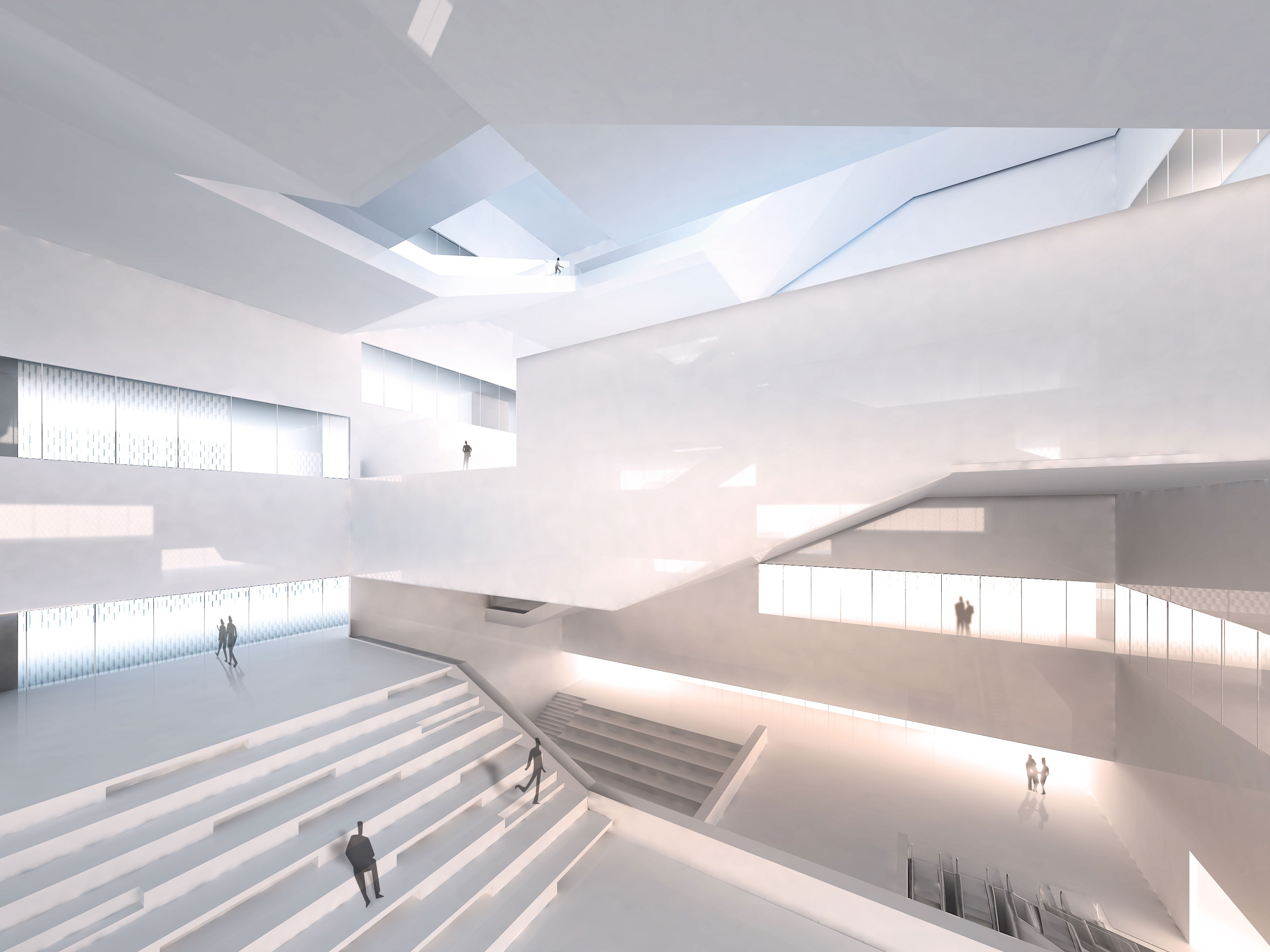
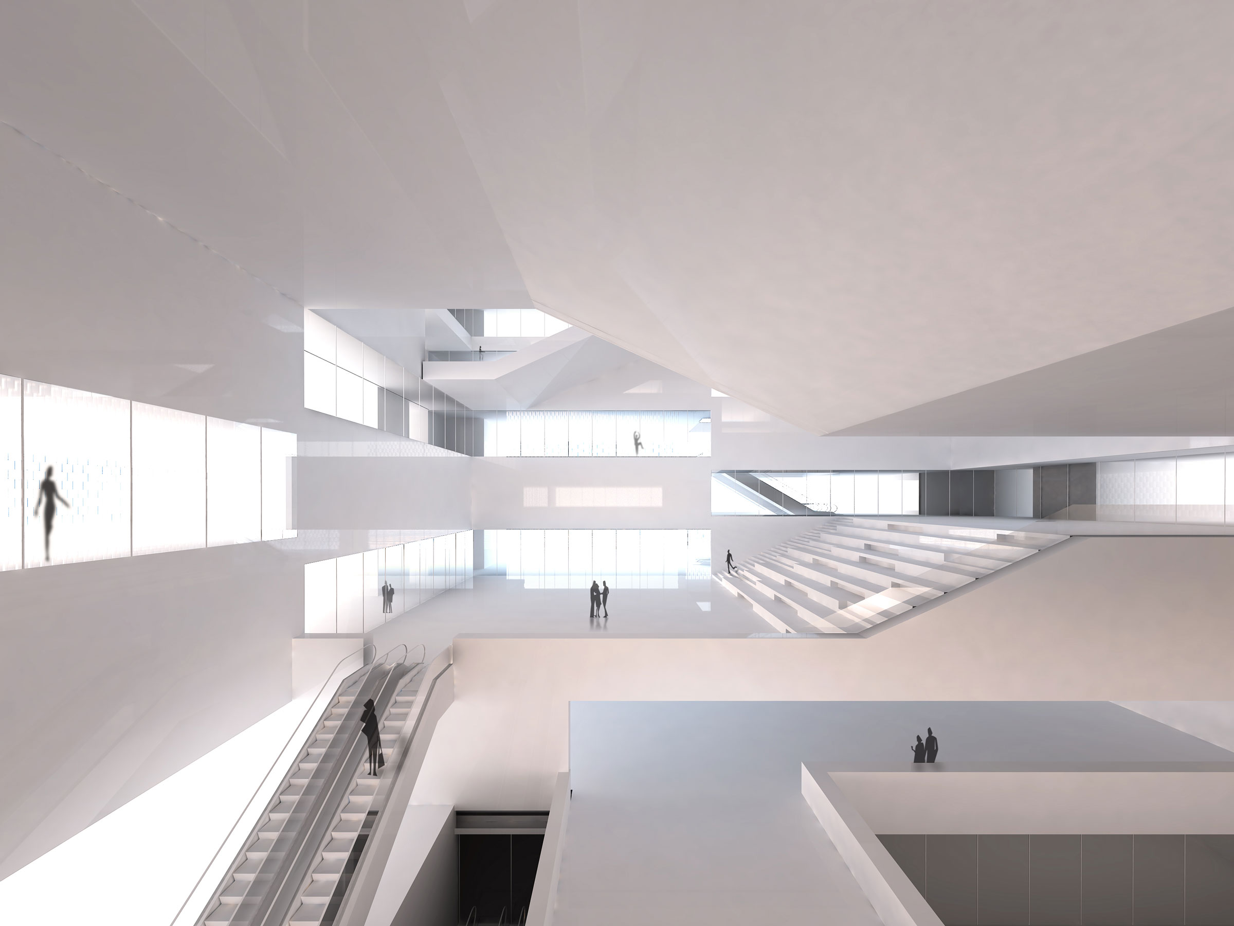
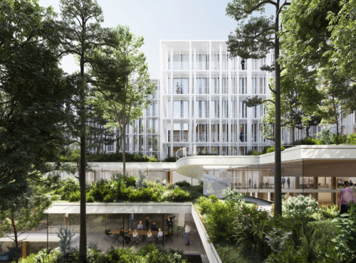
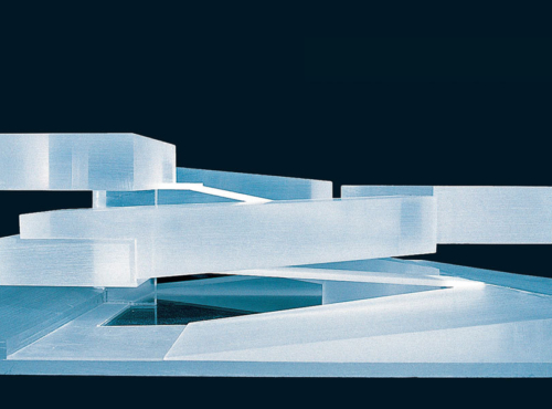
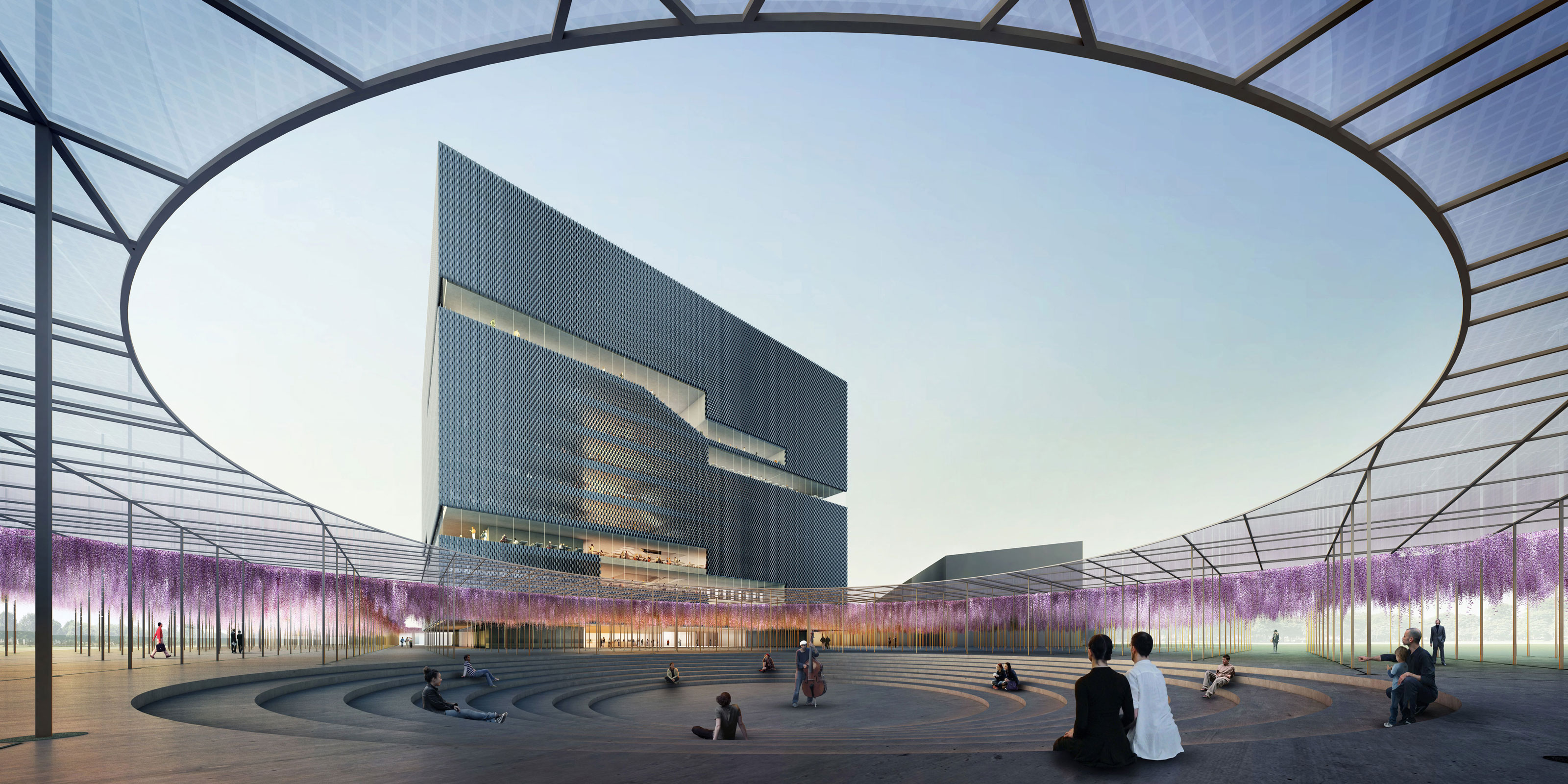
The construction of a central library in the 21st century is required to meet the demands of a classic library, as well as provide low-threshold access to digital information and communication in general. The transition from old to new also addresses the issue of urban space: the cube sits between the conflicting priorities of the new quarters and the park landscape of Tempelhofer Feld and therefore functions as a beacon. It also needs to account for the main flows of pedestrians and the junction of public transport such as the S- and U-Bahns. The striking structure is immediately surrounded by the „poetic mystery forest“: A wysteria canopy arching over the entire scene of the library provides a complex play of light and shadow and density and colour during the change of the seasons.
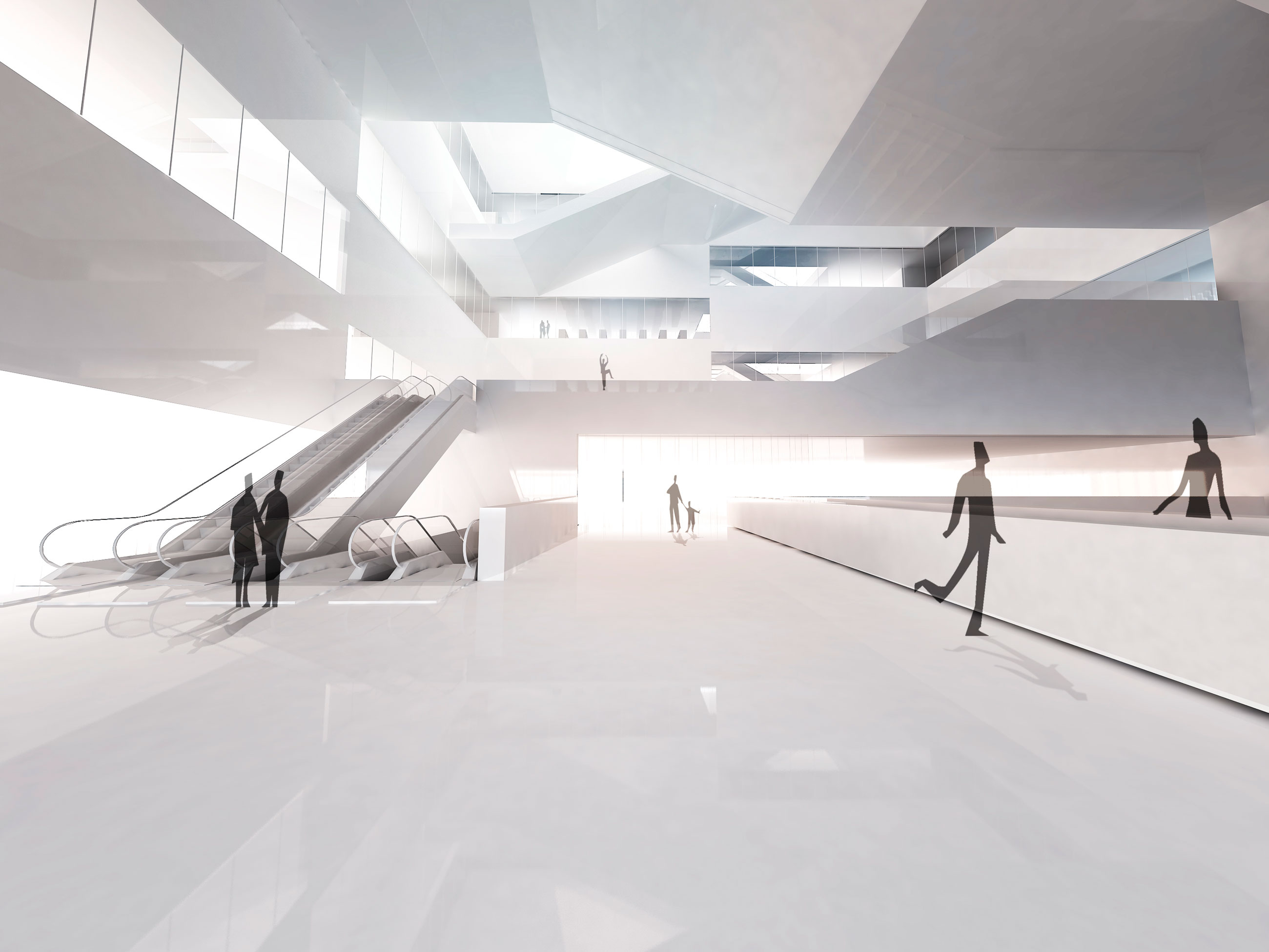
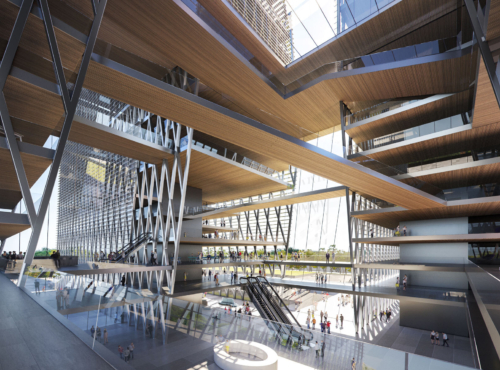
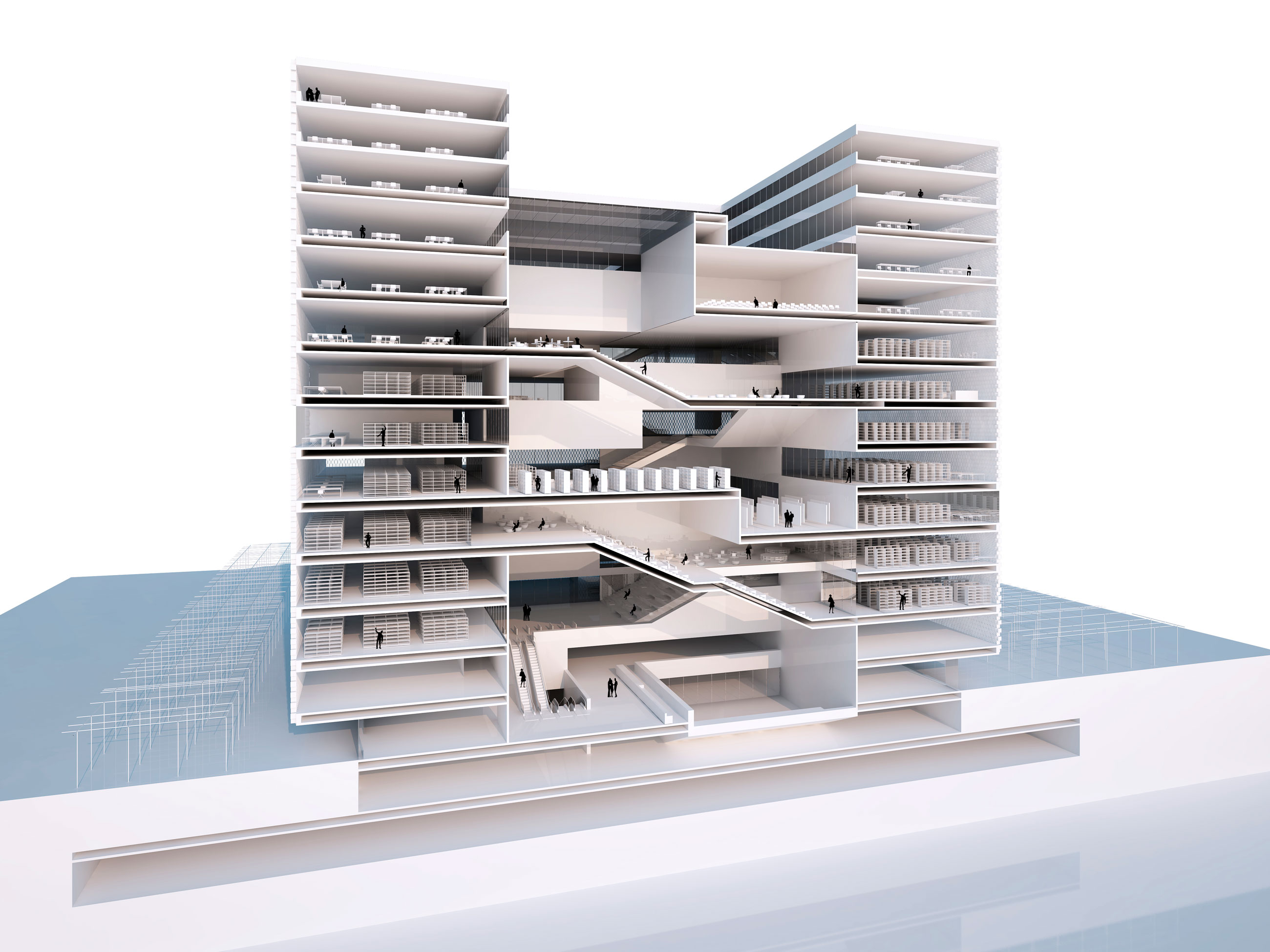
The hub function in the public foyer is carried on into the barrier-free structure itself. The public event space with restaurants on the ninth floor (the highest publicly accessible floor) acts as a counterpoint to this.
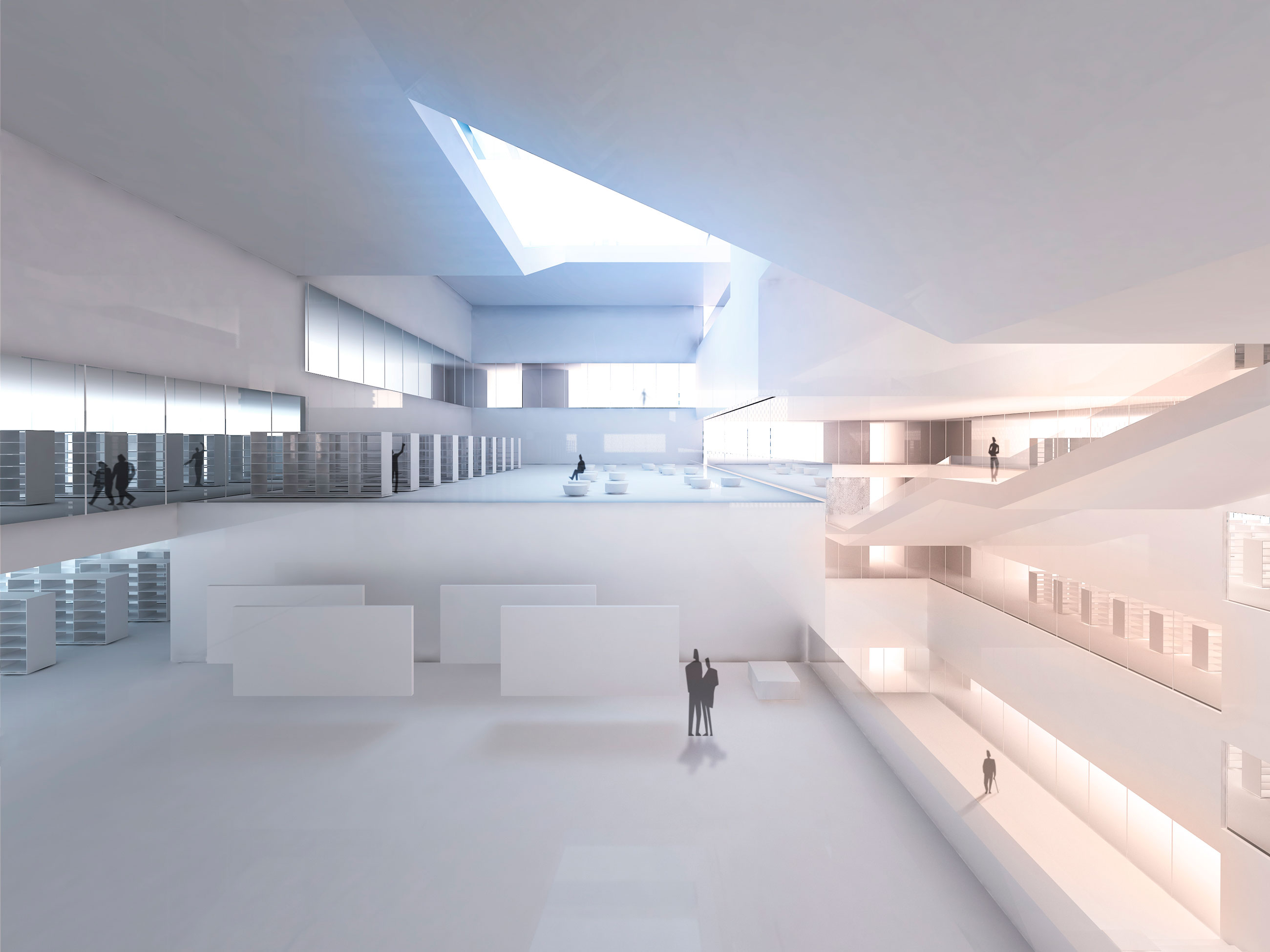
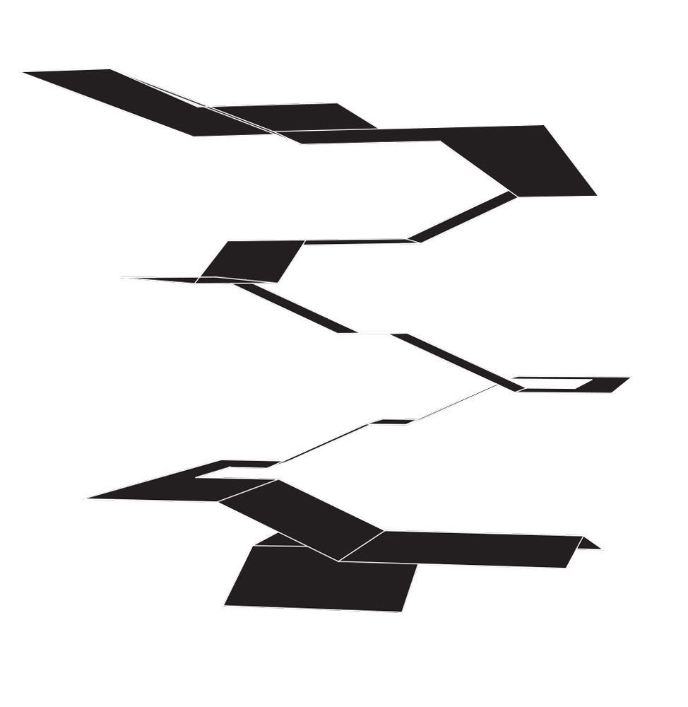
The areas of the free scene and the administration lie above this. In between are the library sections and the path for the flaneur, which represents an underlying architectural concept. The closed stacks and shipping and disposal areas are housed in the basement.
Adress
Berlin
Tempelhof-Schöneberg
Competition
2013
Floor area
52.088m²
Gross surface area
84.542 m²
Construction volume
415.583
Built-up area
21.080 m²
Hight
60 m
Number of levels
15
Number of basements
1
Project manager
Sebastian Brunke
Project team
Michael Lohmann
Diogo Teixeira
Bogdahn Hambasan
Catarina Mendonça
Alejandro Carrera
Elisabeth Kofler
Francesca Caldesi
CONSULTANTS
Structural engineering
Vasko + Partner Ingenieure ZT GmbH
Building Services Engineering
Vasko + Partner Ingenieure ZT GmbH
Bulding physics
Vasko + Partner Ingenieure ZT GmbH
Façade
Vasko + Partner Ingenieure ZT GmbH
Landscape Design
Burger Landschaftsarchitekten, Susanne Burger und Peter Kühn
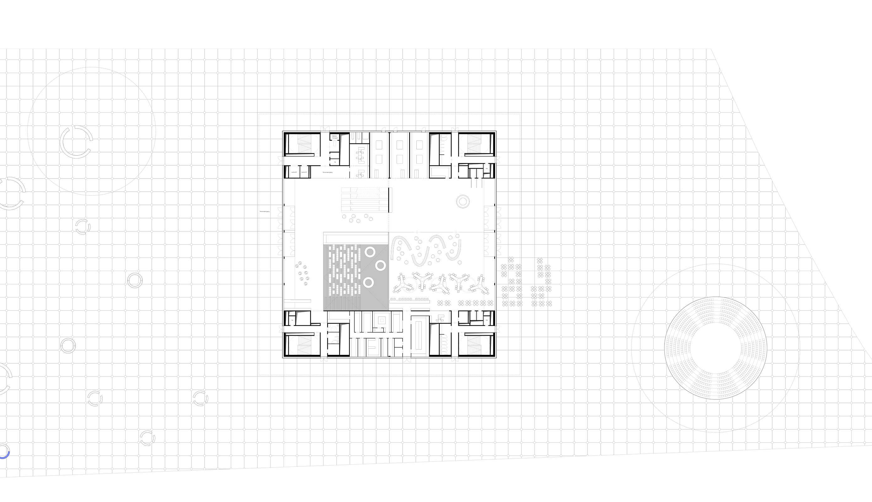
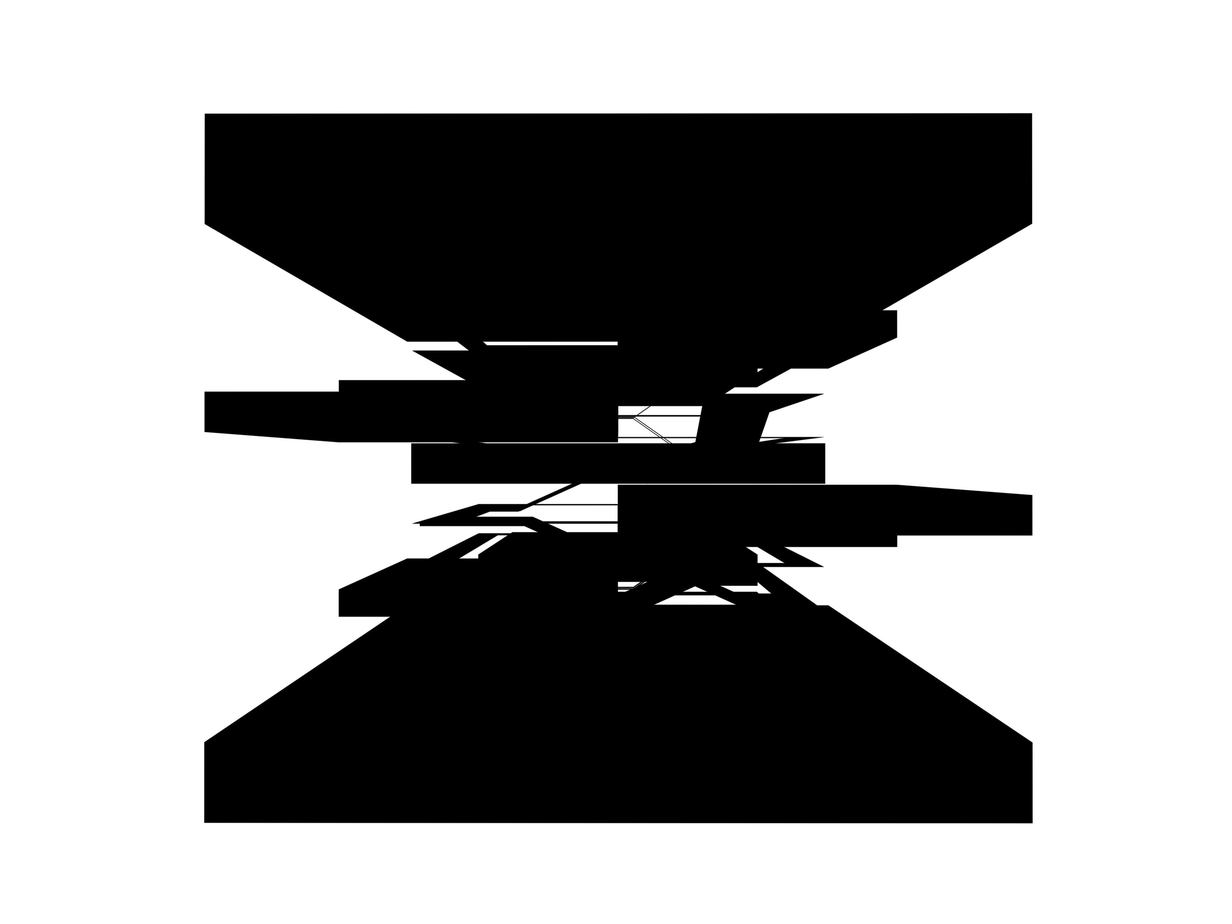
ground floor plan

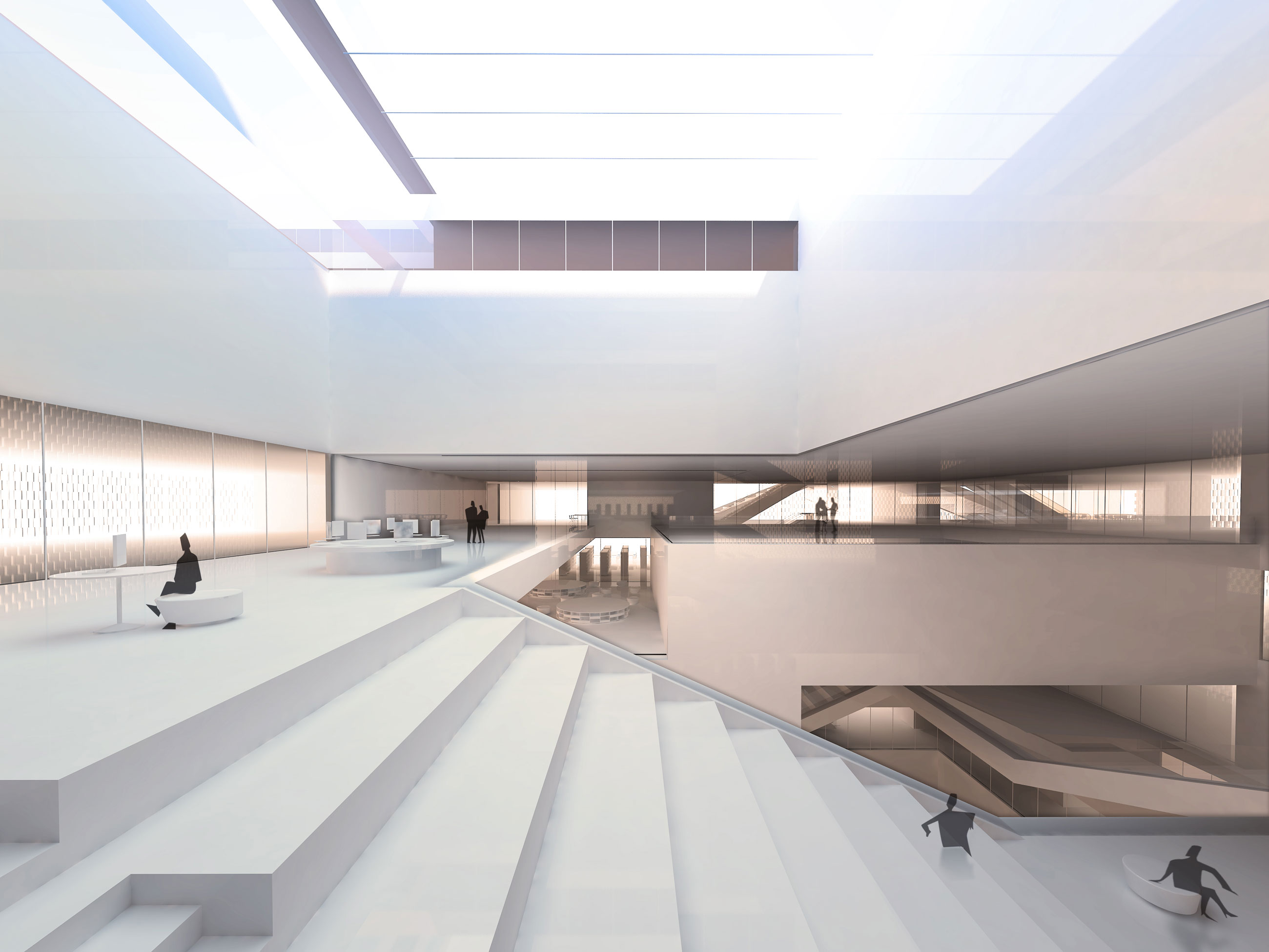
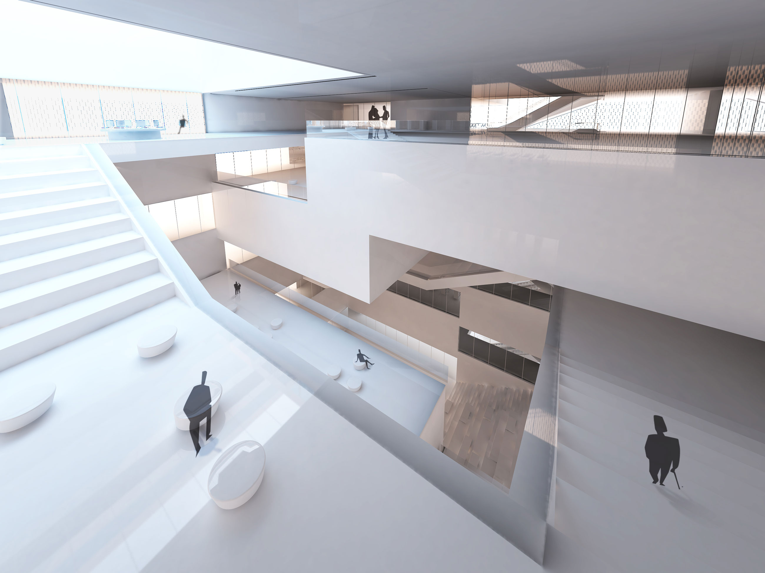
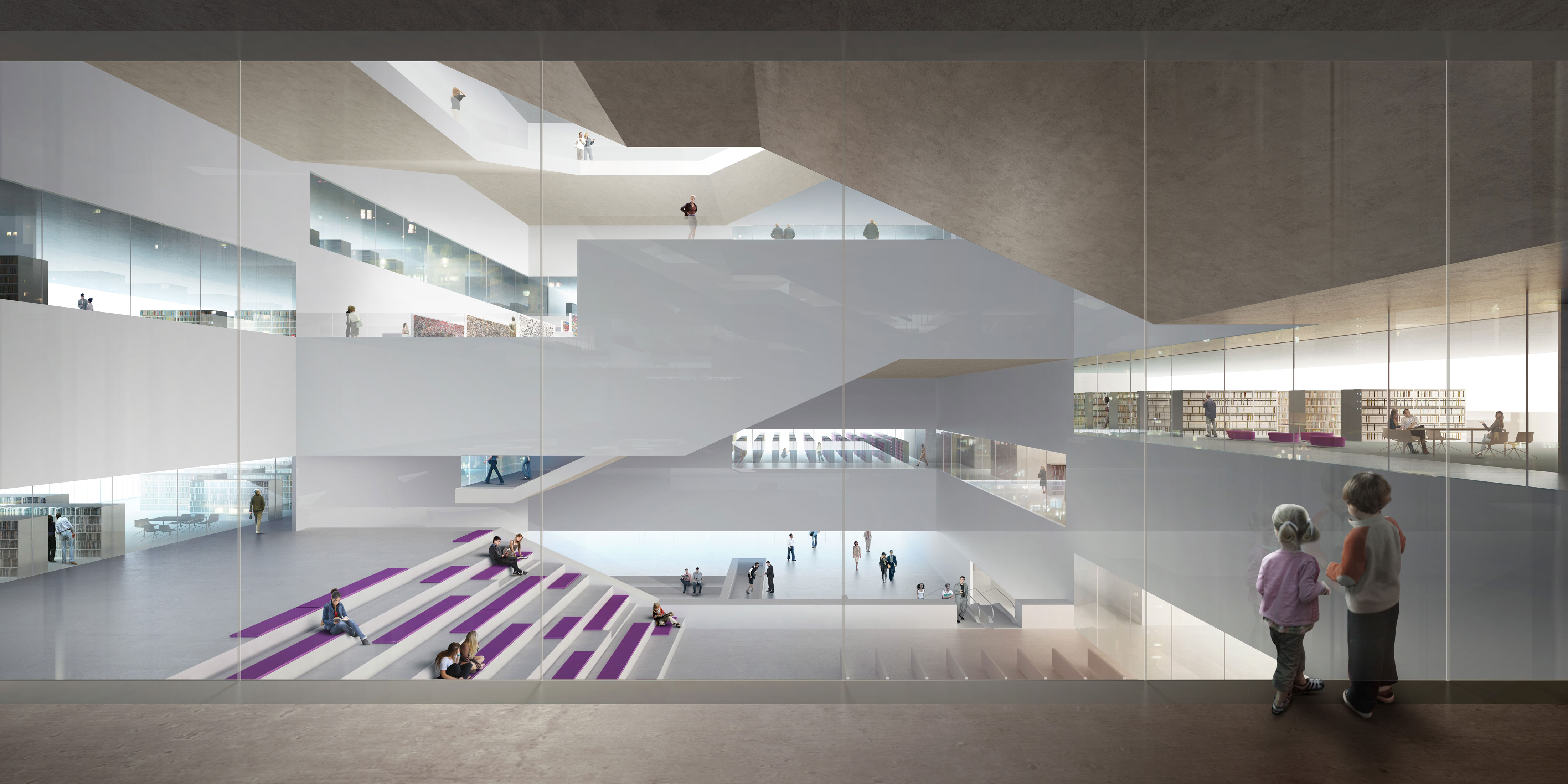
Meeting at the levels of the library sections, the available spaces graduate from the inside, the catalog and info area graduate outwards, and the work stations graduate in their intensity. However, special attention is thereby given to a strong visual link between the outer ring and central zone.
The materials used are kept to a minimum: warm terrazzo, concrete, and various acoustically effective surfaces.
The façade is divided into a thermally effective primary façade made from opaque and transparent elements, with a horizontal grid that makes reference to the library and office grid. Over this primary façade a poetic-looking vertical lamella matrix is stretched, which moves about freely acting as sun protection and which changes the appearance of the building depending on the light and wind direction.
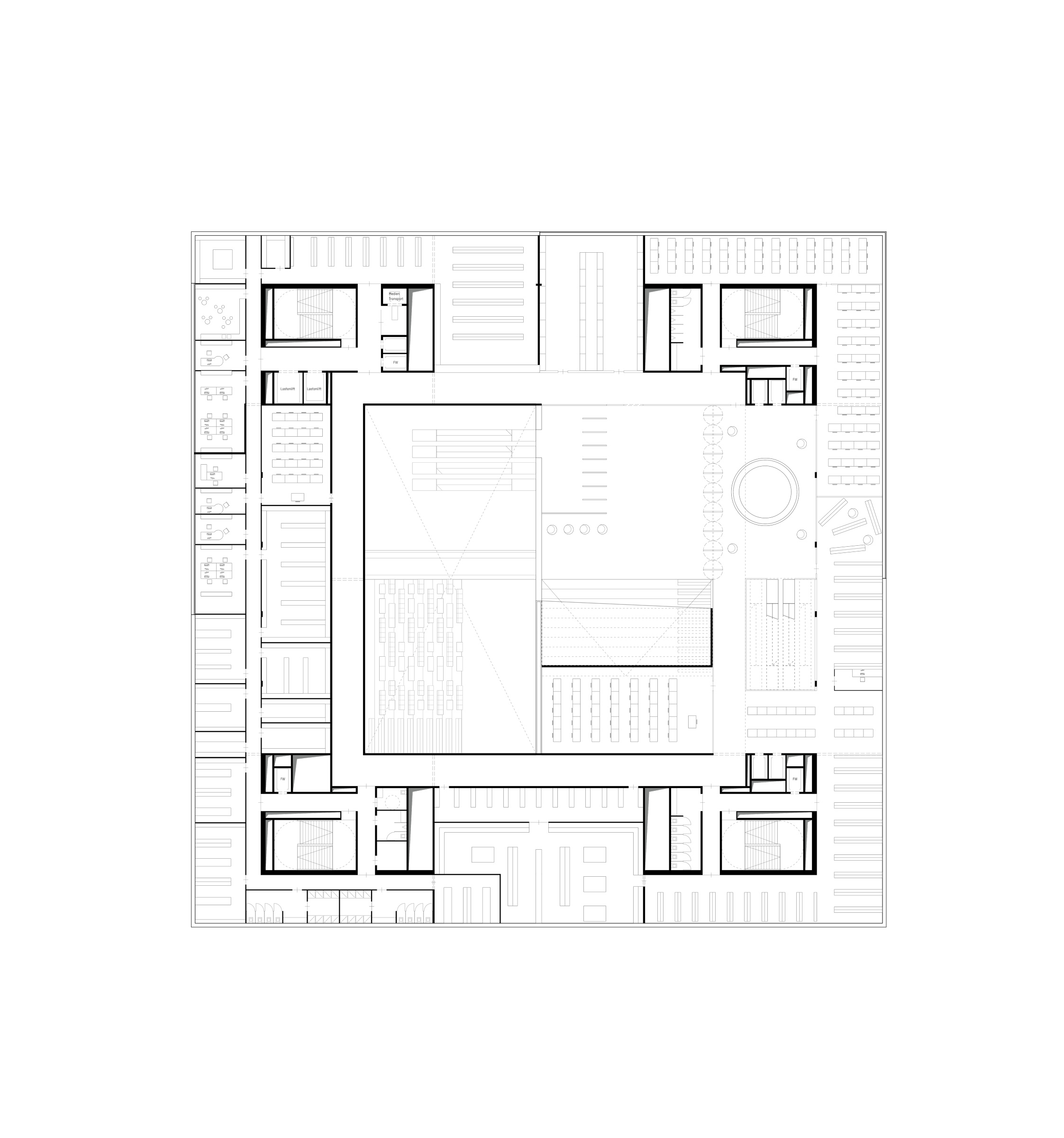
floor plan level 01
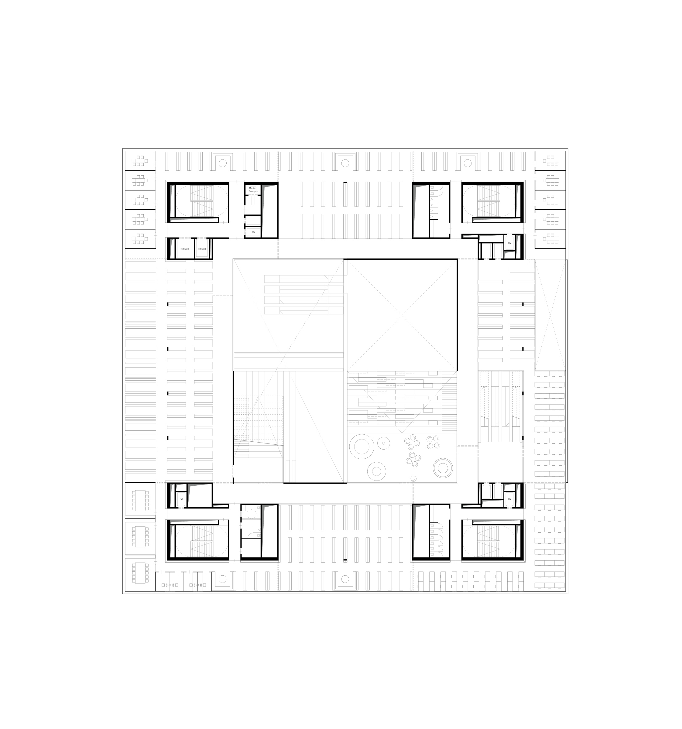
floor plan level 02
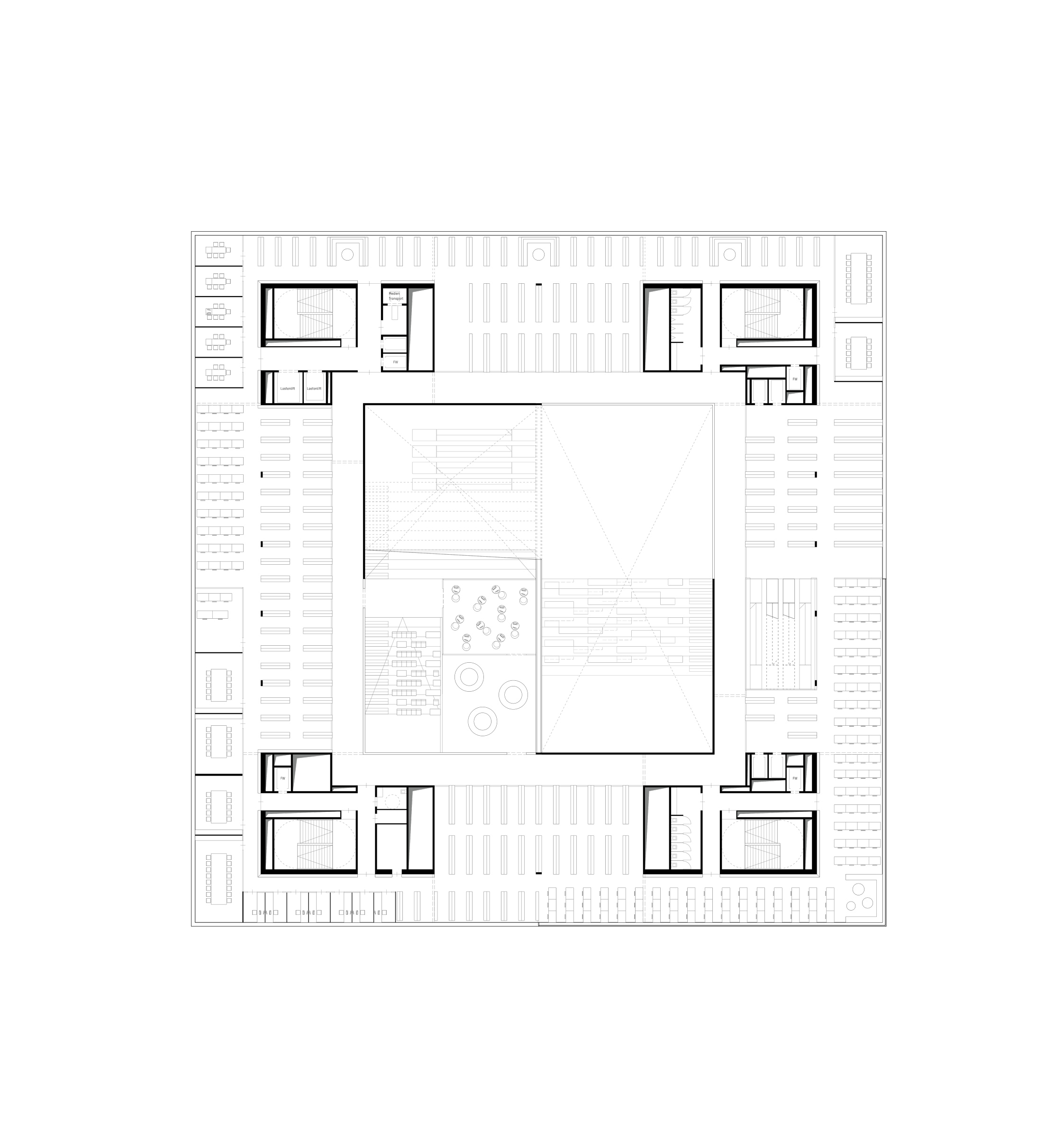
floor plan level 03
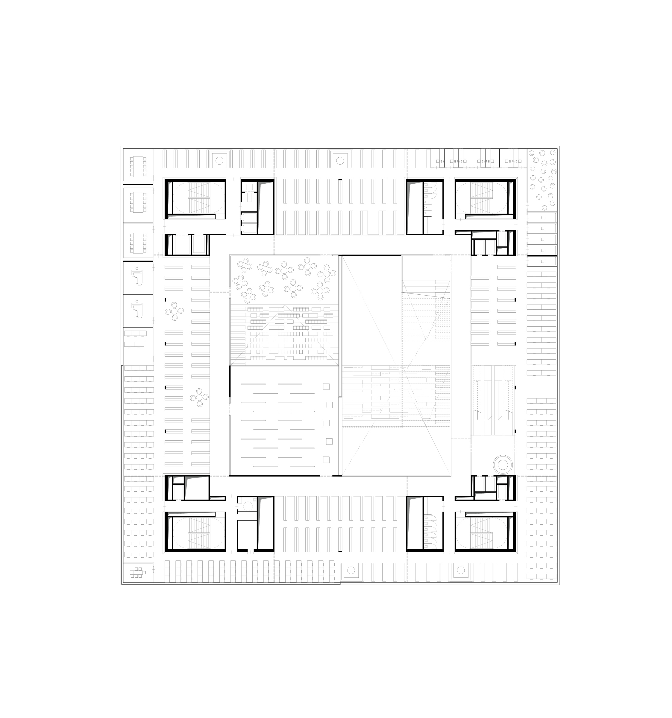
floor plan level 04
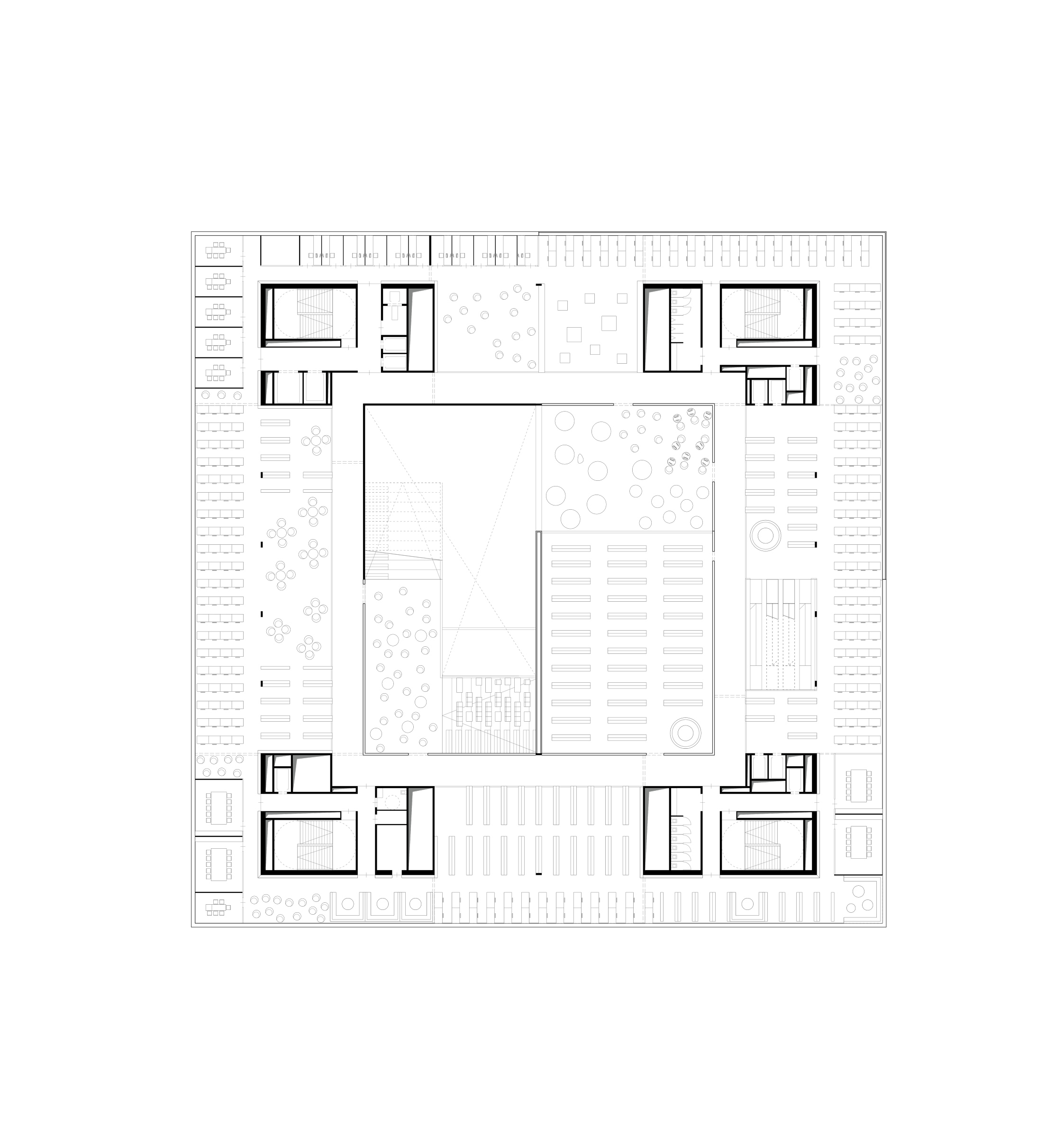
floor plan level 07
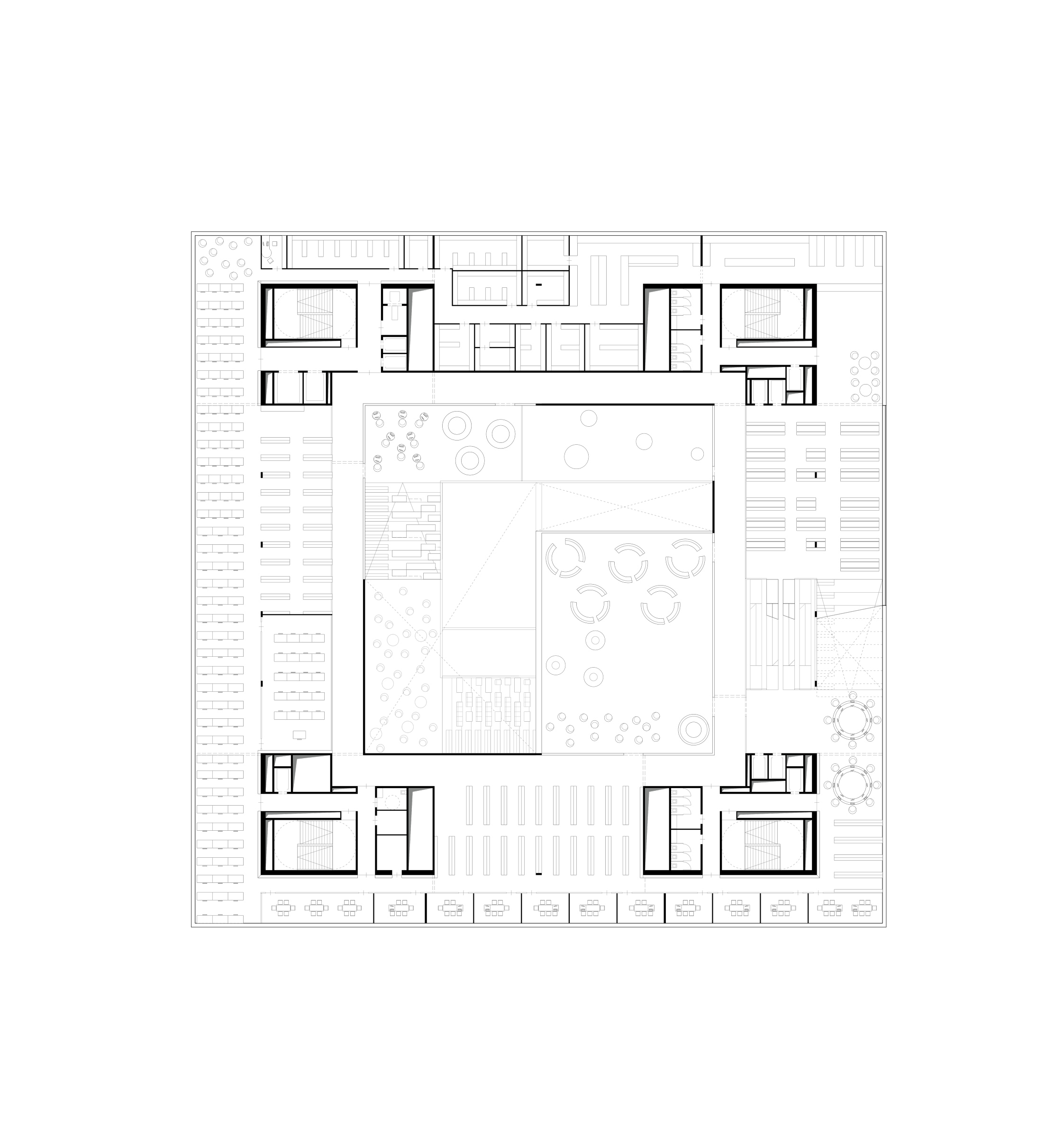
floor plan level 08

floor plan level 09
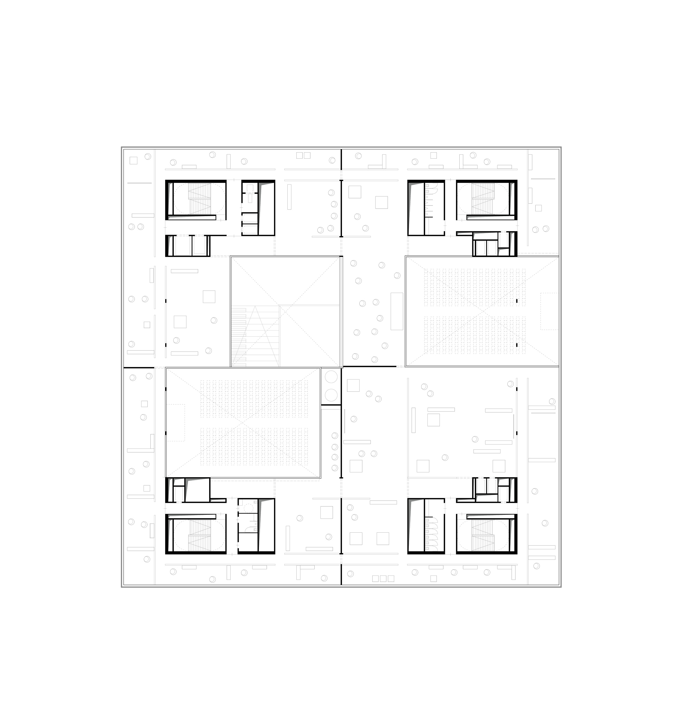
floor plan level 10
