Austria
- Office
- Built
Tradition and identity on the one hand, innovative spirit and vision of the future on the other – the cornerstones of the company philosophy of the MIBA Group – shape in a balanced way the design of the building and are represented in a newly re-created working environment.
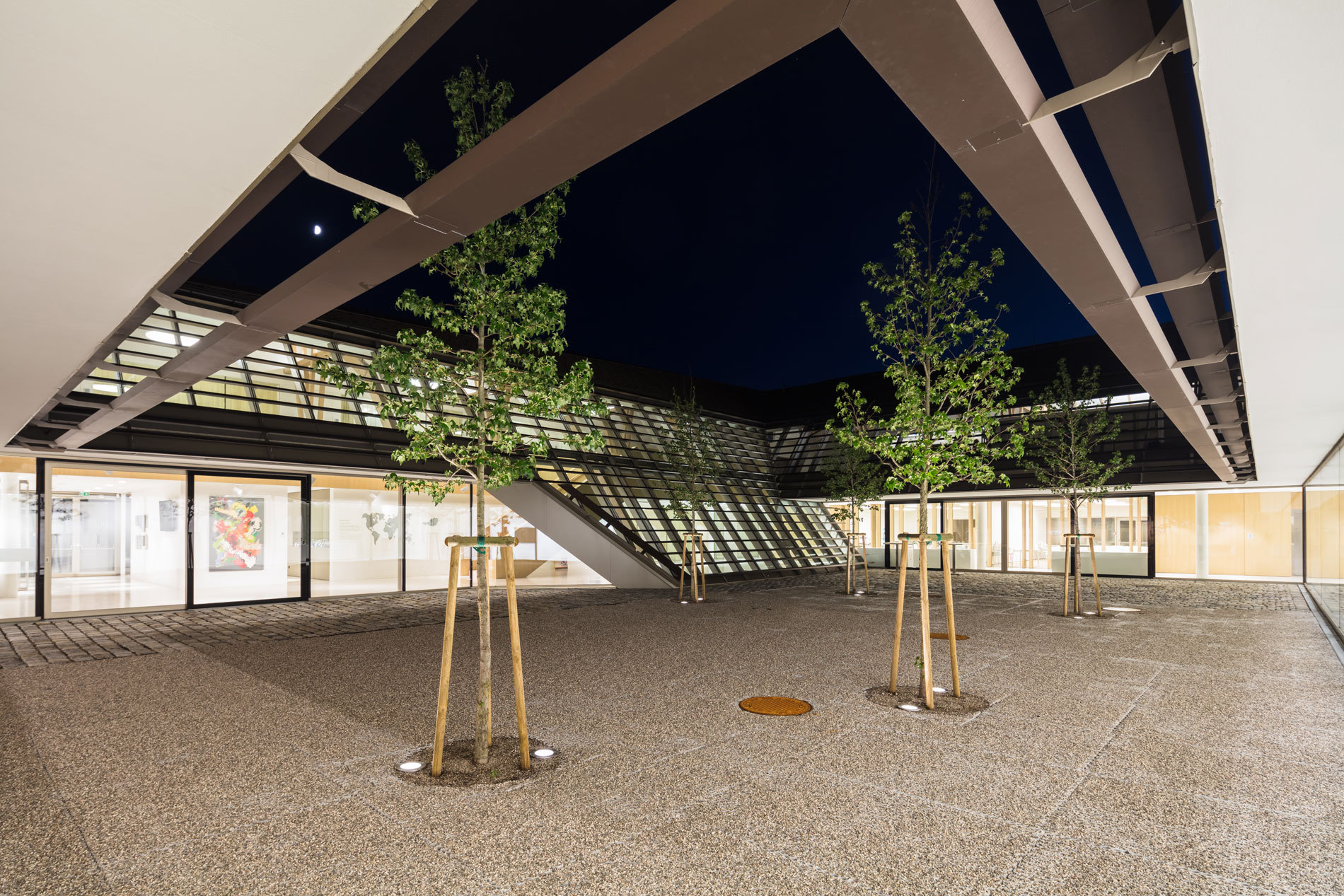
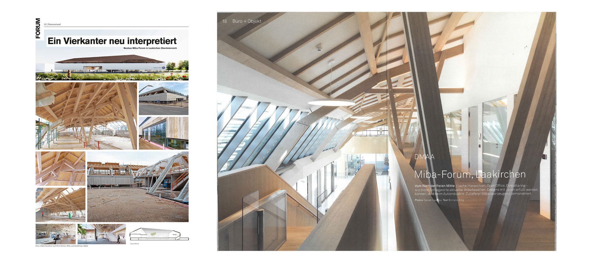
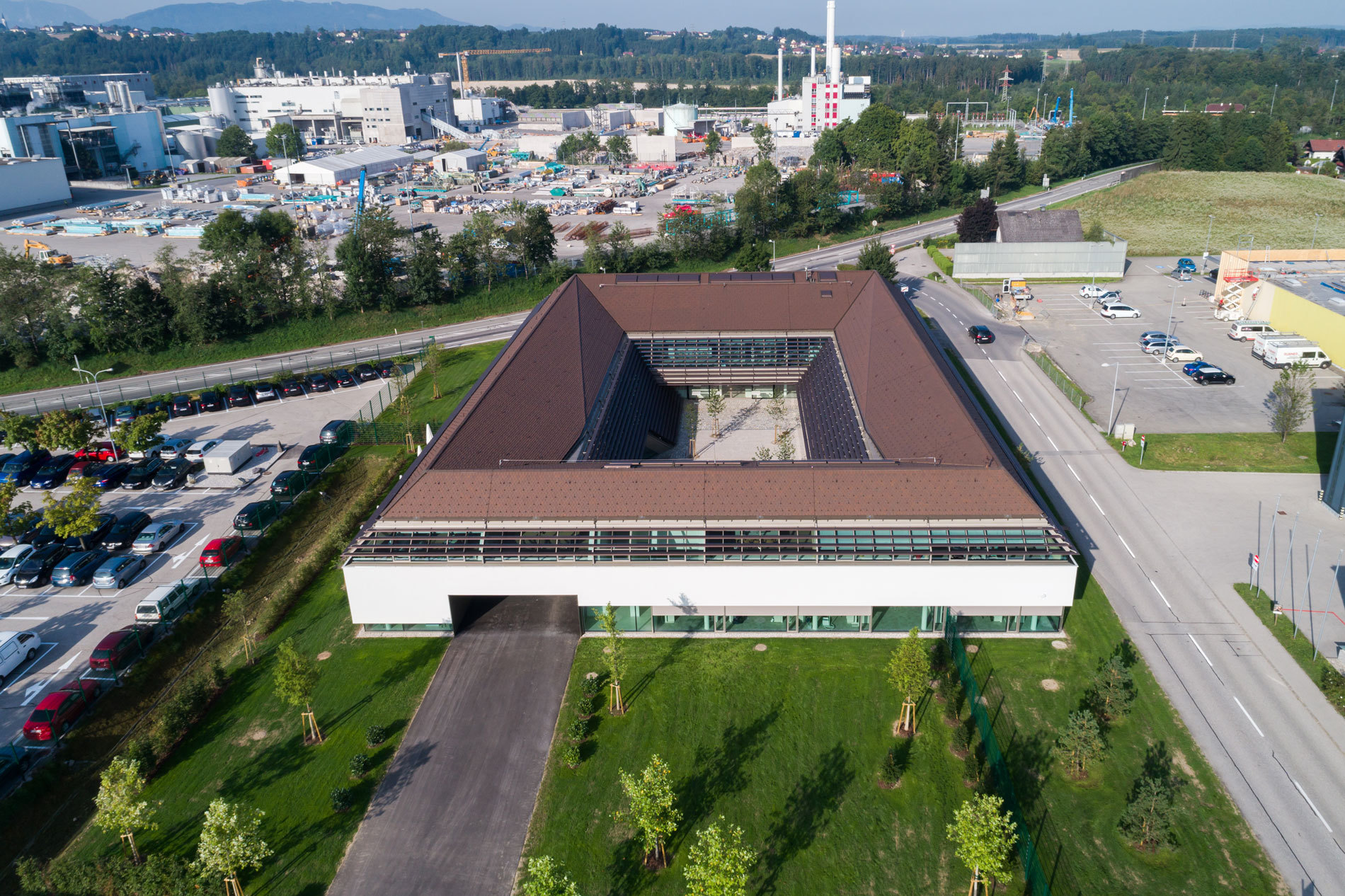
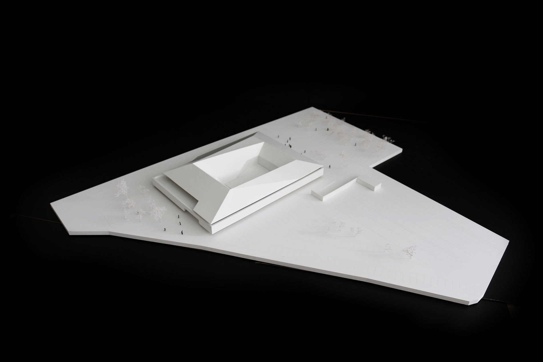
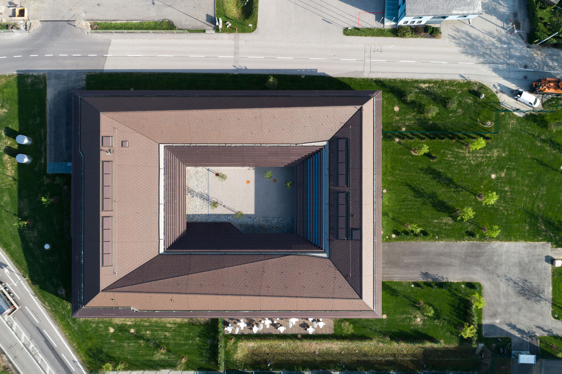
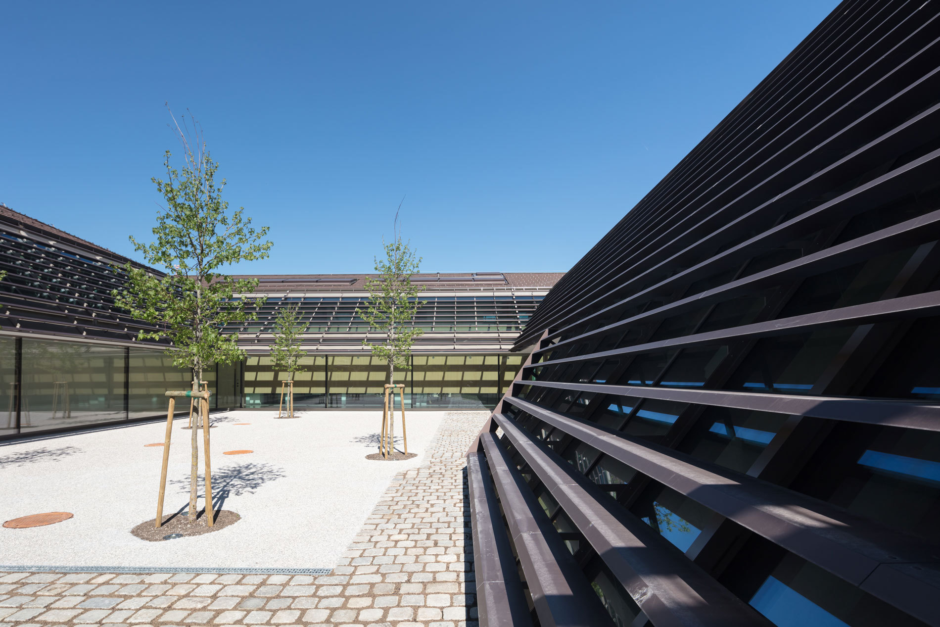
A regionally deep-seated architectural form is chosen rather than anonymous, zeitgeisty “brand-architecture” in order to do justice to the complex requirements of the building as a place for communication and encounter, as well as its representative function of an internationally active company. The traditional architectural typology of the region – the four-cornered courtyard building – is newly interpreted to transpose the identity-building values of the company as well as functional requirements in a contemporary setting.
A natural landscape in front of the building establishes visual relations to the company premises with a special focus on the MIBA Academy and the core of the company represented by its historical buildings. Generous tree plantings define attractive free space zones, while grassland-orchards help to embed the new area into its natural environment.
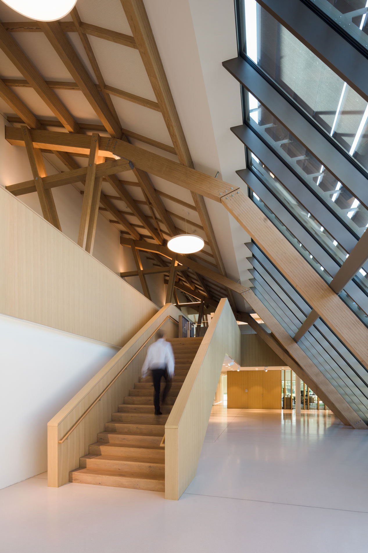
The diverse functional areas are grouped together on two floors around an inner courtyard. Core areas such as “Encounter and Cooperation”, “Technology”, “Learning and Growing” are situated on the ground floor of the building and create a functional unit together with the client and service area. An exhibition area, which surrounds the courtyard, represents the linking element for all zones. With this area MIBA Group gains an adequate space for its own representation. A generous void above the foyer creates a spatial passage towards the multifunctional office floor.
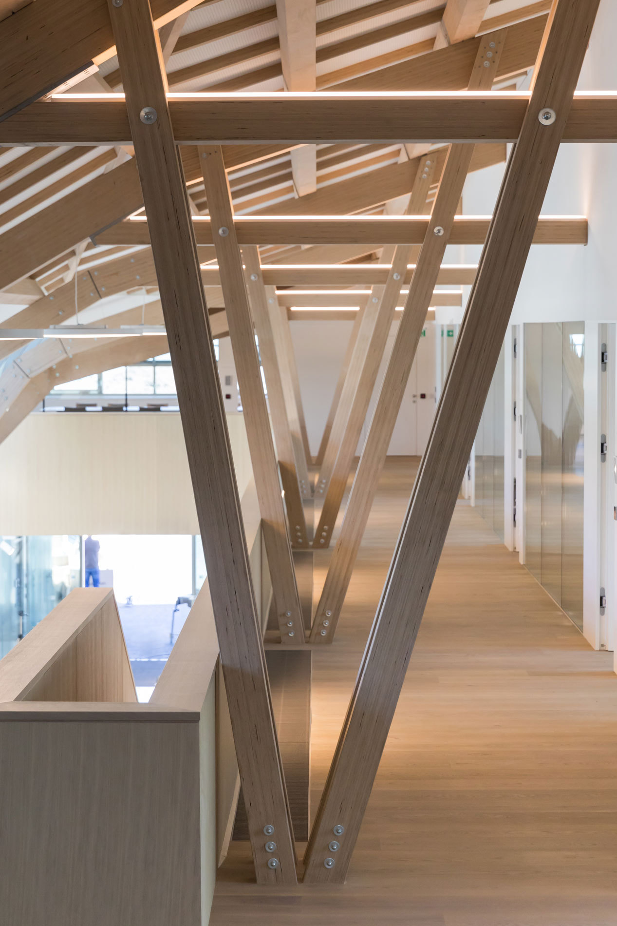
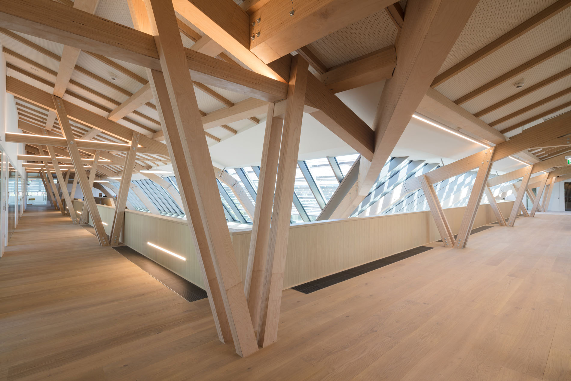
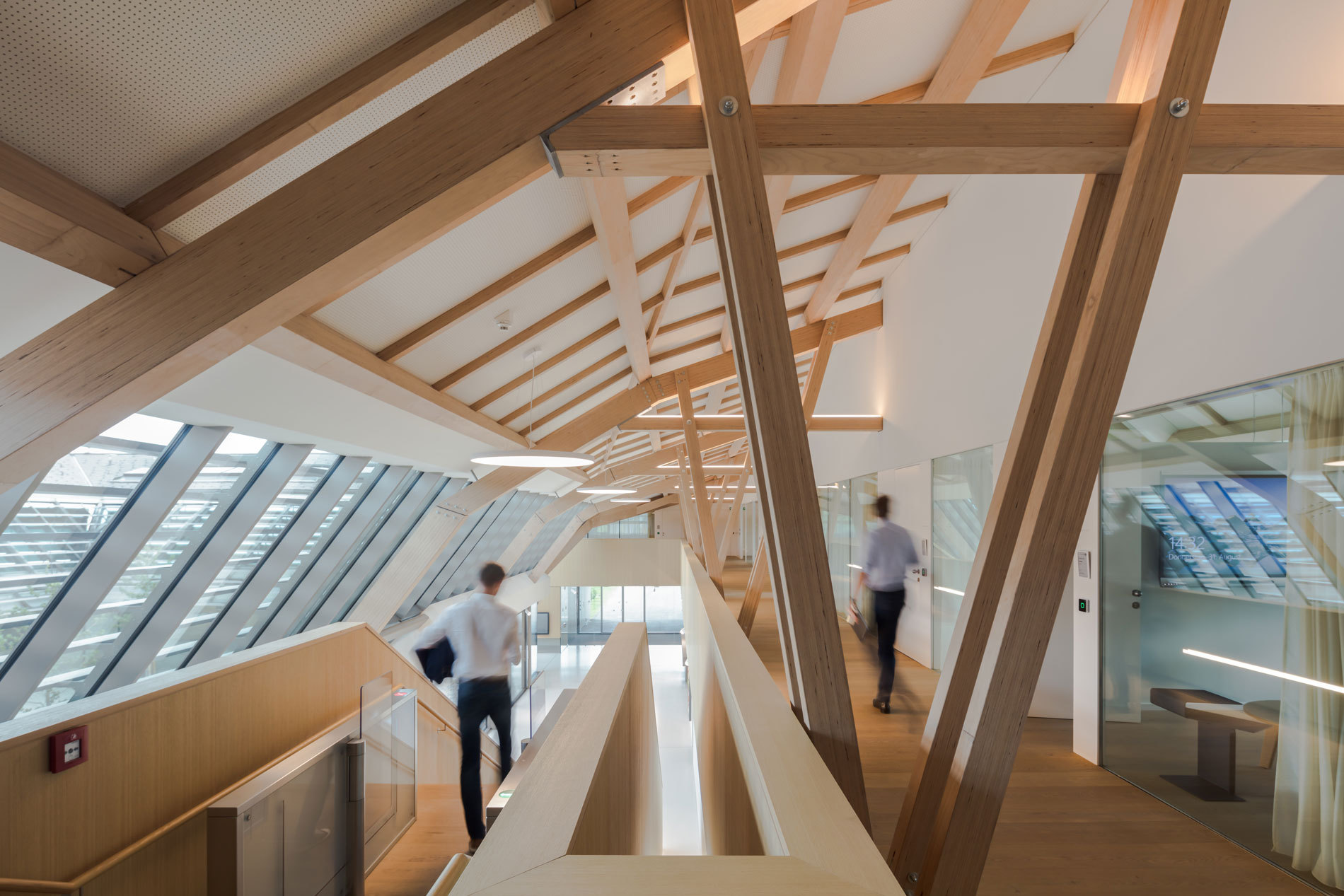
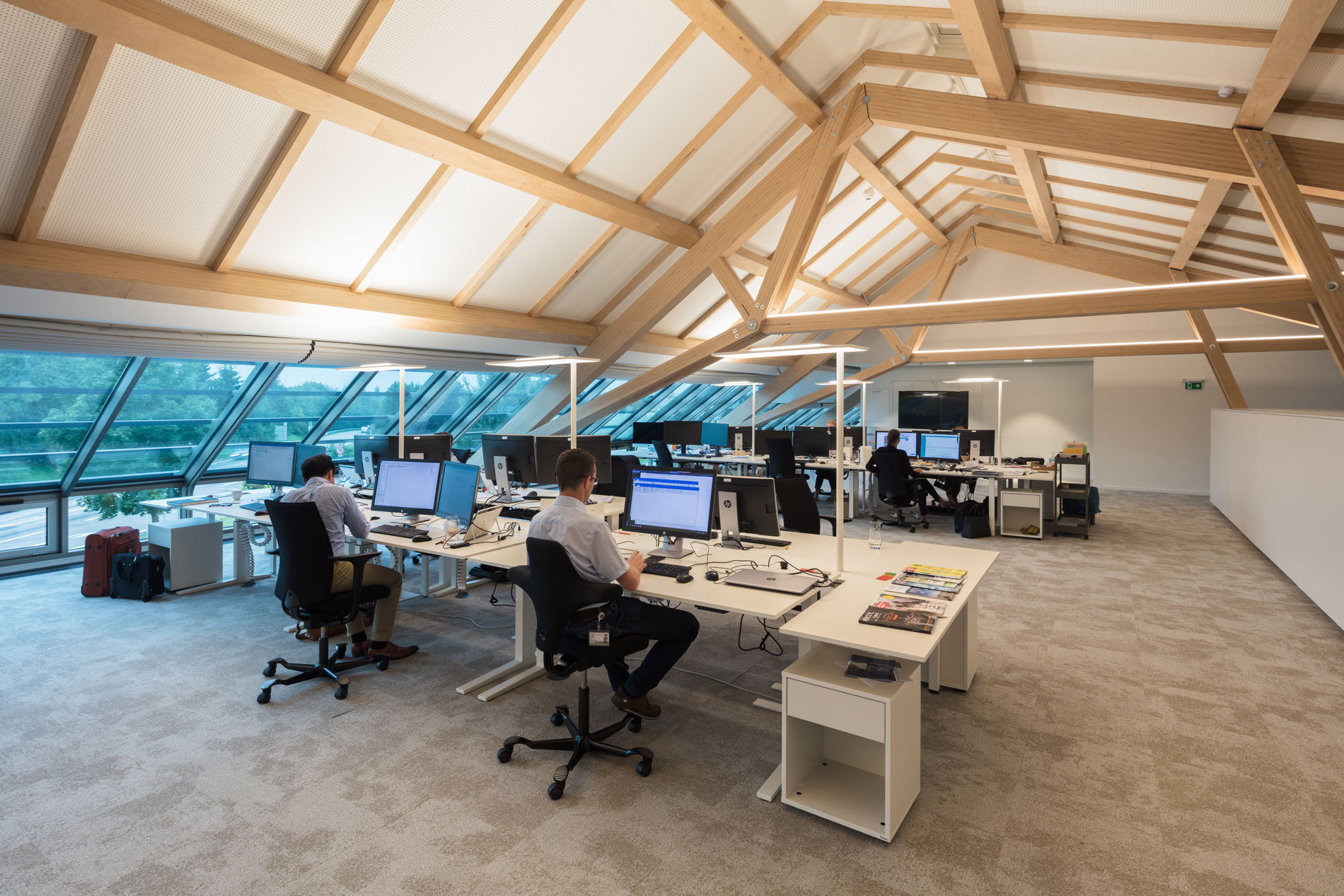
The vertically offset upper floor accommodates the office area, which is flexibly modifiable allowing for intimate office spaces on the one hand and open-plan and combi-office typologies on the other. The roof spans over the differentiated areas thus creating an identity-building spatial construct, which stands in a continuous visual relationship with the company area, its employees as well as its clients.
The appearance of the building from the outside is affected by a plastered outer wall ring with a founded area of ceramic roofing. Ribbon glazing defines the break between the floor and the roof. Offset ceramic lamellae are situated in front of the glazing in the roof cladding and thus structure the defining roof construction.
The design incorporates spatial transitions in diversified transparency – from the compact façade to the open inner courtyard.
Address
Dr.-Mitterbauer-Str. 3
4663 Laakirchen
Austria
Competition
2014
Start of planning
2014
Completion
2017
Floor area
3.450 m²
Gross surface area
4.620m²
Construction volume
33.300 m²
Site area
5.336 m²
Height
10,5 m
Number of levels
2
Number of basements
1
Costs
€ 11 Mio.
Project Manager
Gerhard Gölles
Project Team
Daniela Hensler
Jan Svoboda
CONSULTANTS
Project Controlling/
Project Management
Tilz & Partner
Bauconsult GmbH
Local Construction Supervision
Bubel Eichhorn ZT GmbH
Structural Engineering
Bollinger + Grohmann
Ingenieure
HVACR/ Electrical Engineering
Energietechnik Malli
Interior Design
in cooperation with
architect Denise Riesenberg
Exhibition Planning
Liquid Frontiers in
cooperation with
Vandasye OG
Client
Miba AG
Photographer
Daniel Hawelka
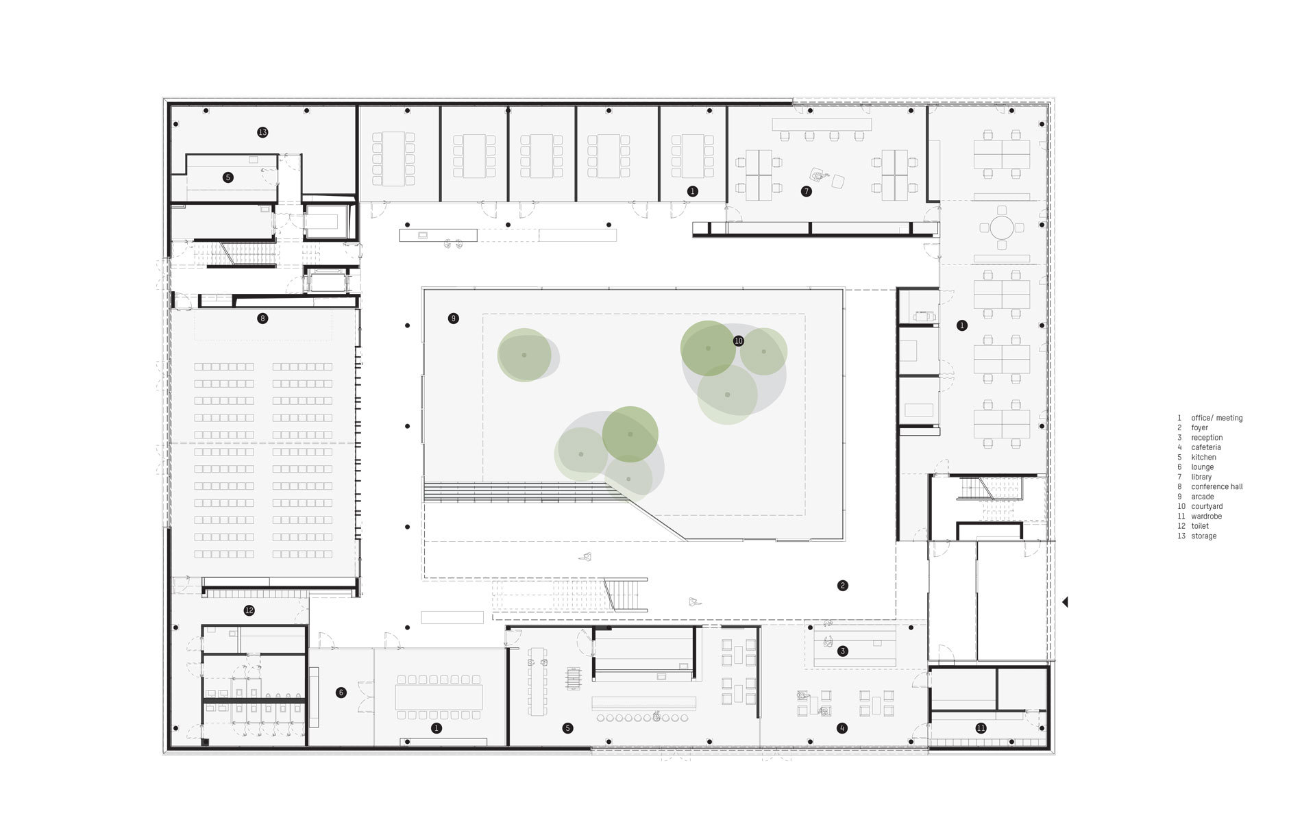
Ground floor plan
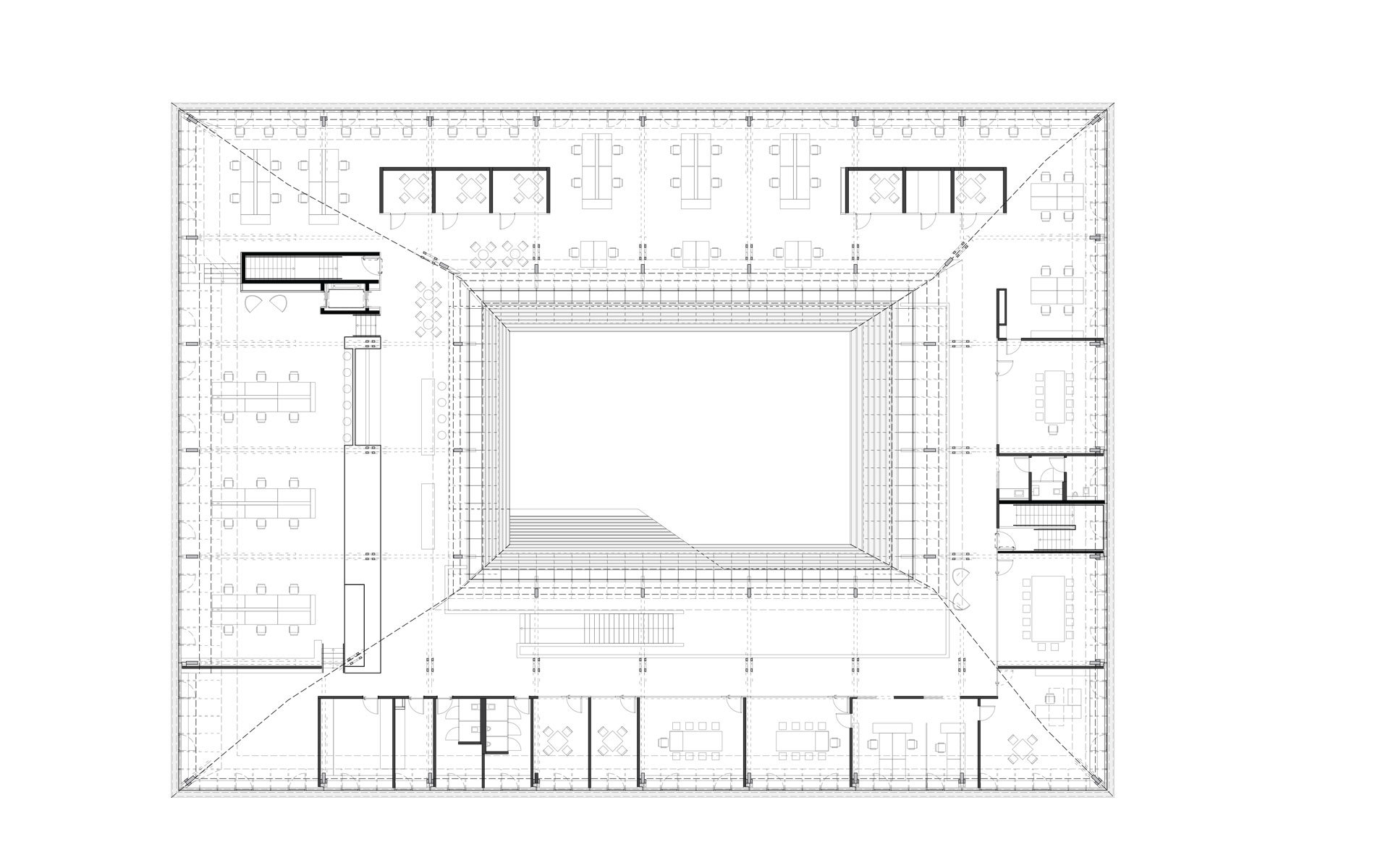
Floor plan level 1
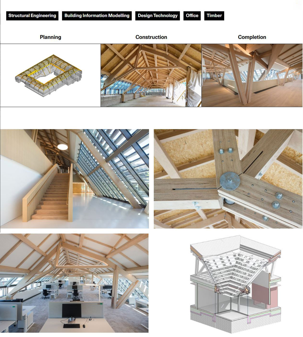
Structural engineering
